product designer
Unifying overlay patterns for a design system
design system ✦ deep research ✦ 2023
Unifying overlay patterns for a design system
design system ✦ deep research ✦ 2023
Researching best practices, auditing our own UI mess, and creating a common language across teams — that’s how I approached the challenge of unifying overlays in our design system. When I joined the effort, different teams were using different patterns, terms, and components for what were essentially the same interactions.
We needed structure, clarity, and alignment — and fast.
My role:
I led the initiative to creating a scalable concept and overlays integrating it into the design system.
Results
Clear UX, faster implementation of new solutions and dozens of hours saved in work communication
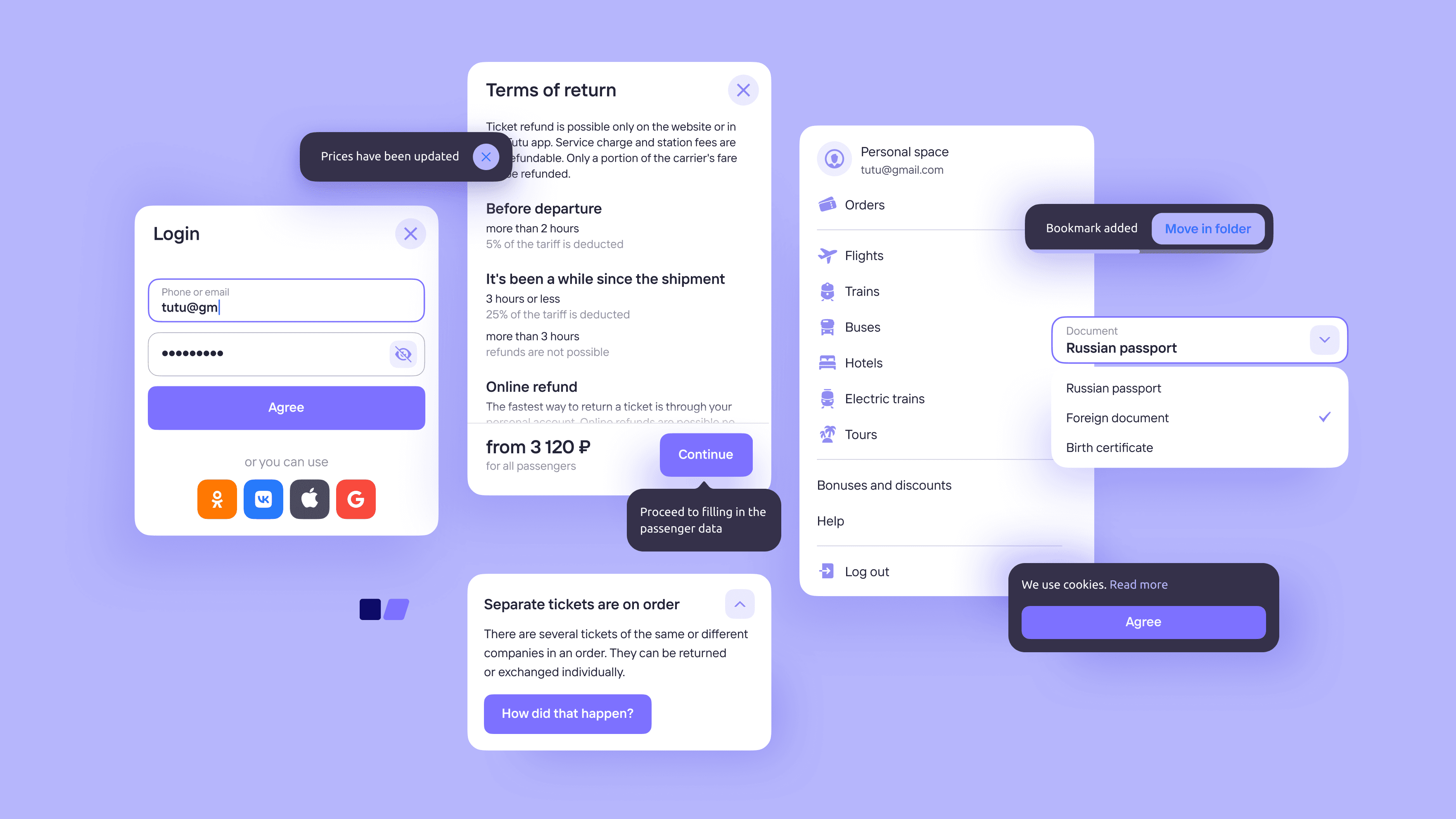
In the early stages of building the new design system, we quickly faced a major problem with overlay components. Over the years, dozens of product teams had accumulated their own overlay variations. There was no unified visual logic, no consistent UX patterns, and no standard terminology. It’s hard to count, but the number of misaligned elements was in the hundreds.
When I took it upon myself to further this task, designers had amassed an initial pool of examples — from notifications and popovers to full-screen overlay and system tooltips. All of them varied in quality and origin. It became obvious that without a common structure and vocabulary, it would be impossible to move forward productively.
Company: tutu.ru
Founded: 2003
Users: 35+M MAU
Market: Russia
Tutu is the most visited online travel service in Russia, where users can buy train, plane and bus tickets, book hotels, find train or bus schedules and use AI travel assistant.
Project Overview
• No systematic approach to overlay components
• Inconsistent and conflicting terminology among designers and developers
• No single source of truth: which overlay types exist, which are needed, when to use them, and what to call them
Problem Definition
• No systematic approach to overlay components
• Inconsistent and conflicting terminology among designers and developers
• No single source of truth: which overlay types exist, which are needed, when to use them, and what to call them
Problem Definition
Inconsistent overlays increased development cost, blocked the creation of shared components, and negatively impacted user behavior throughout the conversion funnel.
Business problem
Users problem
Users faced confusing and unpredictable overlays that behaved differently across the product, disrupting their flow and clarity of actions.
We couldn’t implement cross-selling or display different types of transport in a single search results list
Business problem
Users problem
They found it difficult to navigate when trying to compare or purchase different types of transport

My goal was to research best practices, categorize overlay types, and develop a unified logic that would:
• Ensure consistent UX and UI across all products
• Reduce time spent on creating and maintaining overlays
• Improve communication between designers and developers
• Lay the foundation for predictable, user-friendly interactions
• Indirectly improve funnel clarity by reducing user confusion
Tasks
I started with an audit of best practices — from major Russian tech companies to international design systems. I explored how they define overlay types, name them, describe their behavior, and connect them to real user flows.
In parallel, I collected missing cases within the company, including edge cases and potential future scenarios. This helped shift the perspective — from cleaning up legacy components to making an architectural investment.
Research

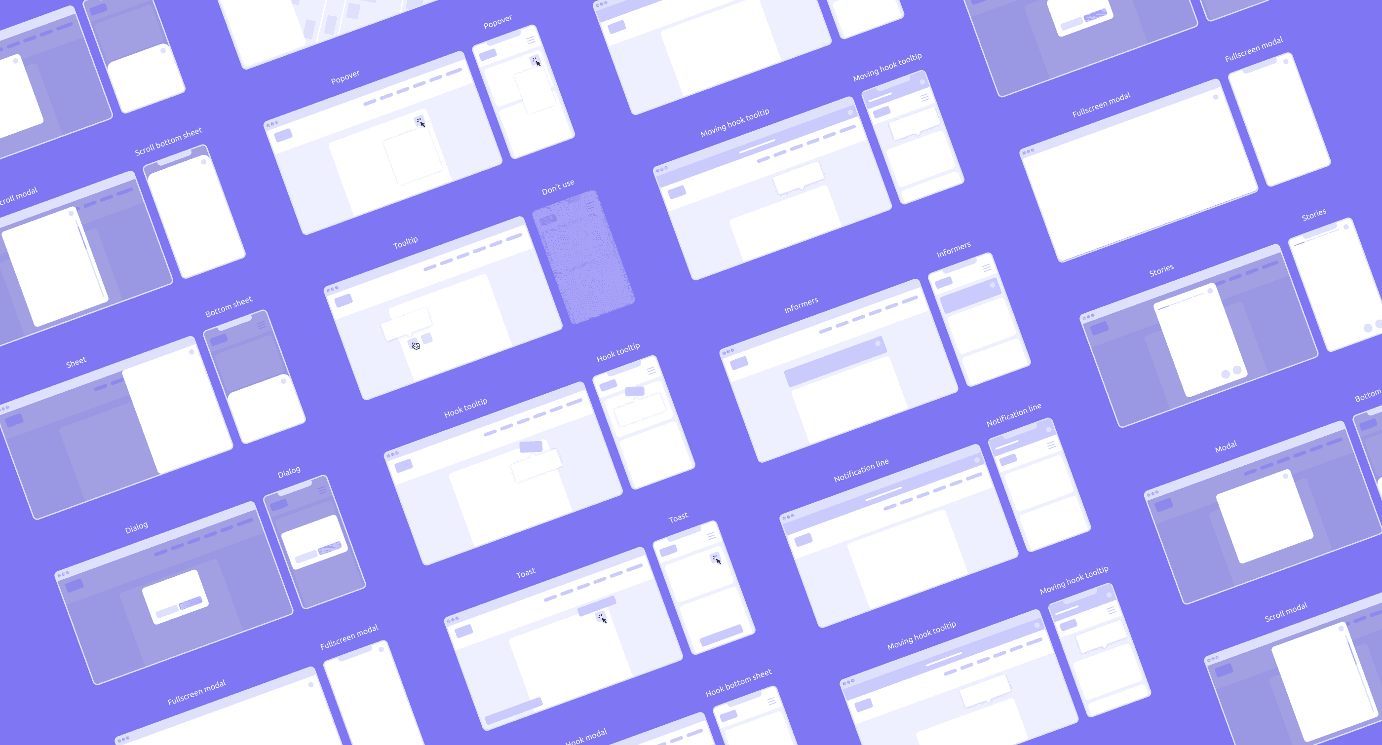
I grouped all overlay components by trigger type and user interaction pattern. This helped untangle the mess — now each element could be described as a combination of behavior and context.
Then came the biggest challenge: terminology. At Tutu, we had a long history of naming chaos. Some called it a “modal,” others “popup,” “overlay,” or something else entirely. This lack of a common vocabulary led to constant misalignment. I collected terminology conflicts, mapped internal naming to best practices, and proposed a new, consistent vocabulary.
Ideation
I grouped all modal components by trigger type and user interaction pattern. This helped untangle the mess — now each element could be described as a combination of behavior and context.
Ideation
I grouped all overlay components by trigger type and user interaction pattern. This helped untangle the mess — now each element could be described as a combination of behavior and context.
Then came the biggest challenge: terminology. At Tutu, we had a long history of naming chaos. Some called it a “modal,” others “popup,” “overlay,” or something else entirely. This lack of a common vocabulary led to constant misalignment. I collected terminology conflicts, mapped internal naming to best practices, and proposed a new, consistent vocabulary.
Ideation


After discussions with the team, we aligned how different overlay types behave on desktop and mobile. For example, a modal window on desktop would transform into a bottom sheet on mobile and in apps — creating a more native experience across devices.
I grouped all modal components by trigger type and user interaction pattern. This helped untangle the mess — now each element could be described as a combination of behavior and context.
After discussions with the team, we aligned how different overlay types behave on desktop and mobile. For example, a modal window on desktop would transform into a bottom sheet on mobile and in apps — creating a more native experience across devices.

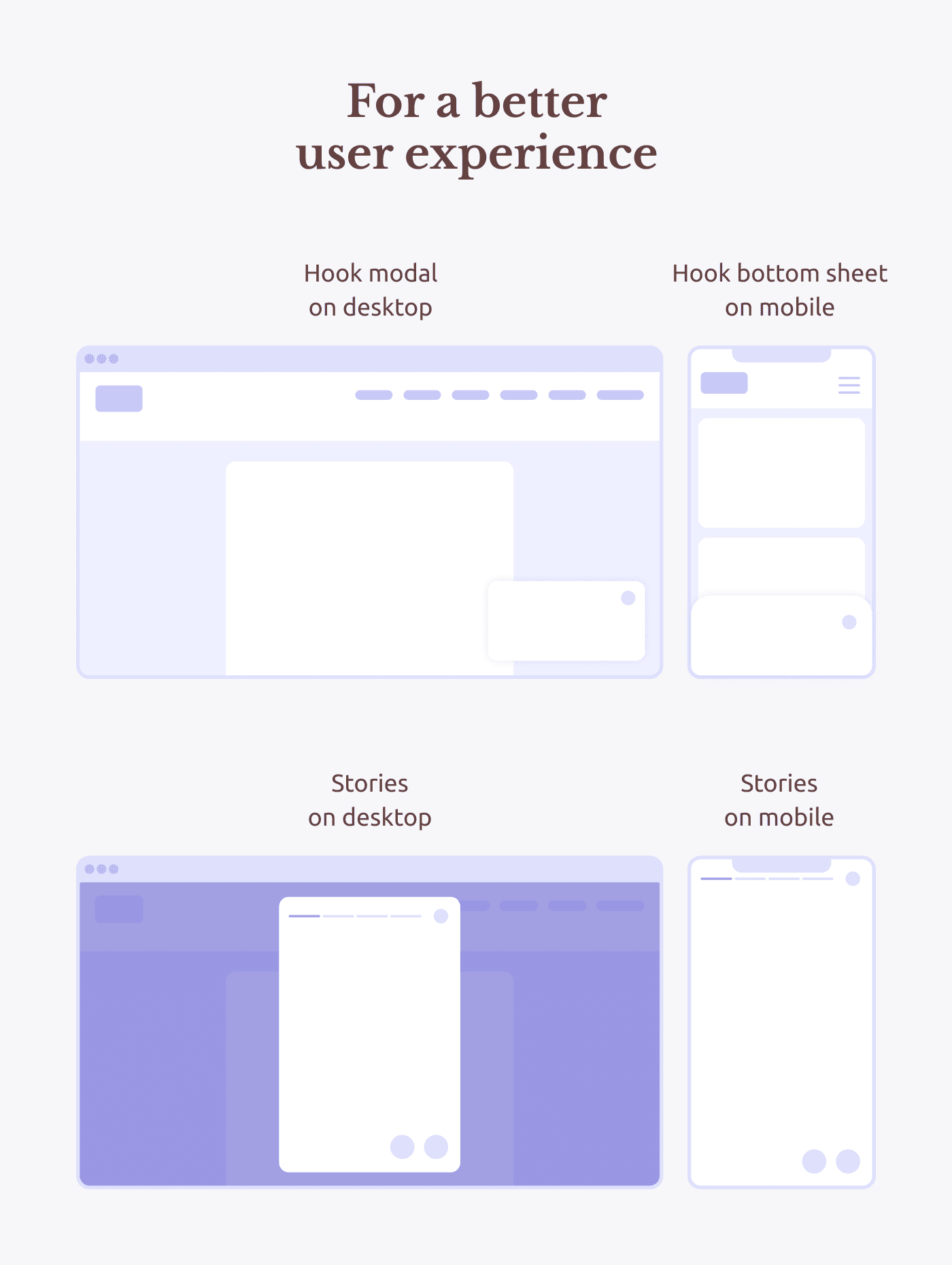
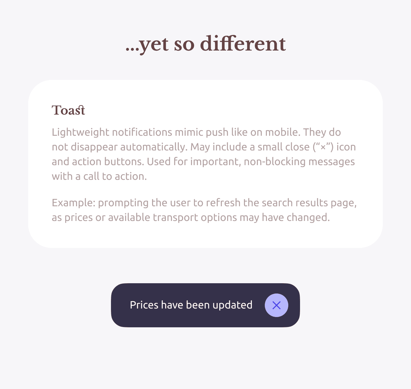
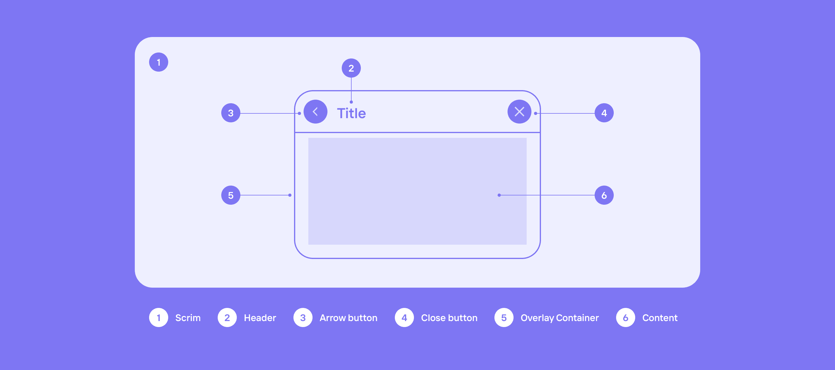
I developed the core UI foundation: corner radii, spacing, icons, headers, interactions. I reimagined how stories galleries, system alerts, login forms, and other patterns could look and behave in our system. As a result, I created:
• A behavior table with examples
• Interactive UI concepts
• A base for Figma components
Concepts
I grouped all modal components by trigger type and user interaction pattern. This helped untangle the mess — now each element could be described as a combination of behavior and context.
Concepts
I developed the core UI foundation: corner radii, spacing, icons, headers, interactions. I reimagined how stories galleries, system alerts, login forms, and other patterns could look and behave in our system. As a result, I created:
• A behavior table with examples
• Interactive UI concepts
• A base for Figma components
Concepts

The design guild tested the system in real-world scenarios on both web and mobile apps. The result was predictable, logical, and easy to use.
Special thanks to designer Alexander Prigorodov, who contributed a decision flowchart for choosing the right overlay type. It’s now part of the documentation and used as a navigation tool.
I grouped all modal components by trigger type and user interaction pattern. This helped untangle the mess — now each element could be described as a combination of behavior and context.
The design guild tested the system in real-world scenarios on both web and mobile apps. The result was predictable, logical, and easy to use.
Special thanks to designer Alexander Prigorodov, who contributed a decision flowchart for choosing the right overlay type. It’s now part of the documentation and used as a navigation tool.
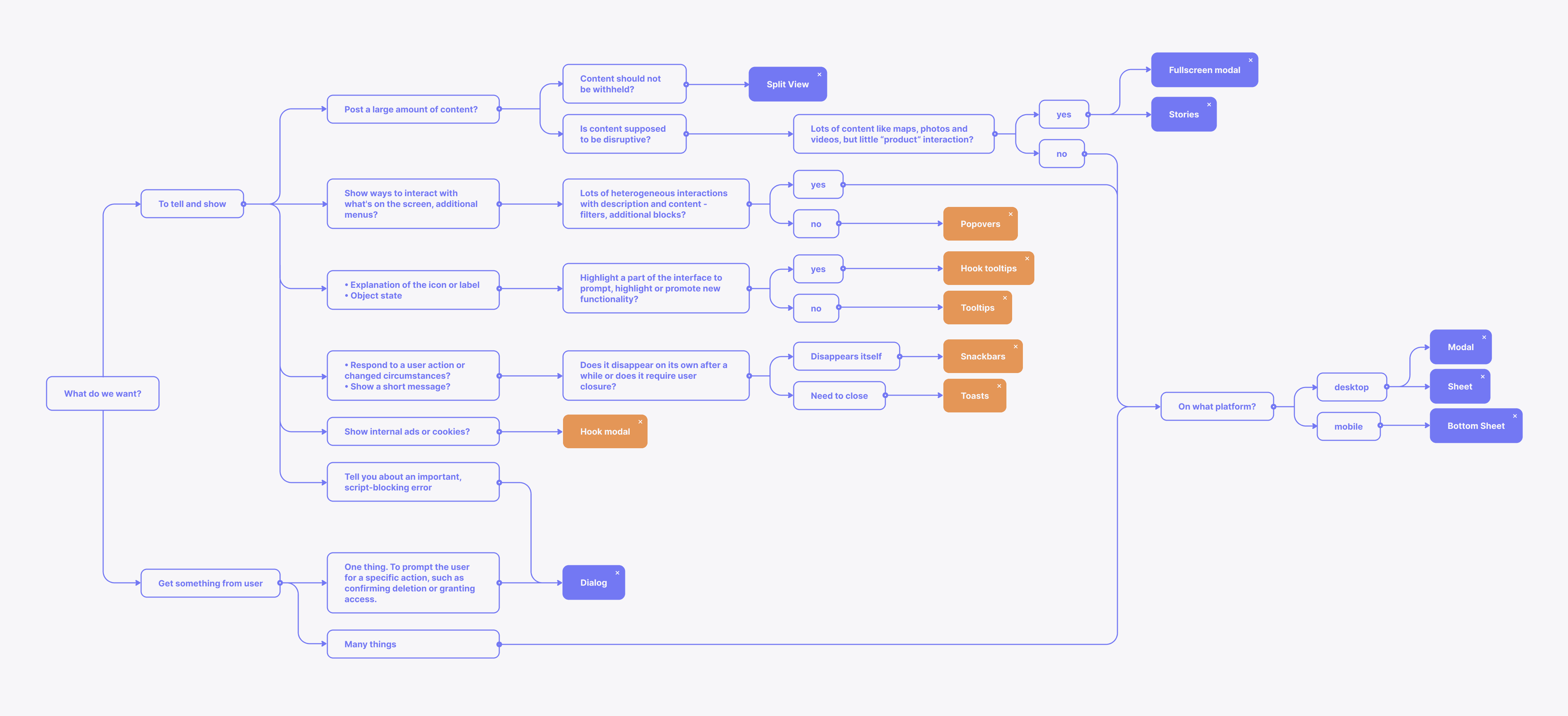
A very useful tool from my colleague
A very useful tool from my colleague
I presented the system to the entire design guild and the design system developers. The discussion was heated — especially about the terminology. But I came prepared: for every term, I had examples, arguments, and, most importantly, a clear purpose — to ensure that designers and developers could finally speak the same language.
We implemented 30% of the components immediately; the rest was phased in to avoid blocking other design system tasks. The key result: we now have a backbone, a logic, and common understanding.
Final solution & design system
I grouped all modal components by trigger type and user interaction pattern. This helped untangle the mess — now each element could be described as a combination of behavior and context.
Final solution & design system
I presented the system to the entire design guild and the design system developers. The discussion was heated — especially about the terminology. But I came prepared: for every term, I had examples, arguments, and, most importantly, a clear purpose — to ensure that designers and developers could finally speak the same language.
We implemented 30% of the components immediately; the rest was phased in to avoid blocking other design system tasks. The key result: we now have a backbone, a logic, and common understanding.
Final solution & design system


• Dozens of hours saved in design-developer communication
• Faster implementation of new solutions — no need to reinvent overlay logic each time
• Consistent and predictable design across products and scenarios
• A more clear user experience for users across the Tutu ecosystem
• A common language — less conflicts, more clarity, and more enjoyment at work
Result
I grouped all modal components by trigger type and user interaction pattern. This helped untangle the mess — now each element could be described as a combination of behavior and context.
Result
• Dozens of hours saved in design-developer communication
• Faster implementation of new solutions — no need to reinvent overlay logic each time
• Consistent and predictable design across products and scenarios
• A more clear user experience for users across the Tutu ecosystem
• A common language — less conflicts, more clarity, and more enjoyment at work
Result
ayano.kaito@gmail.com
© 2025 All rights reserved
ayano.kaito@gmail.com
© 2025 All rights reserved