product designer
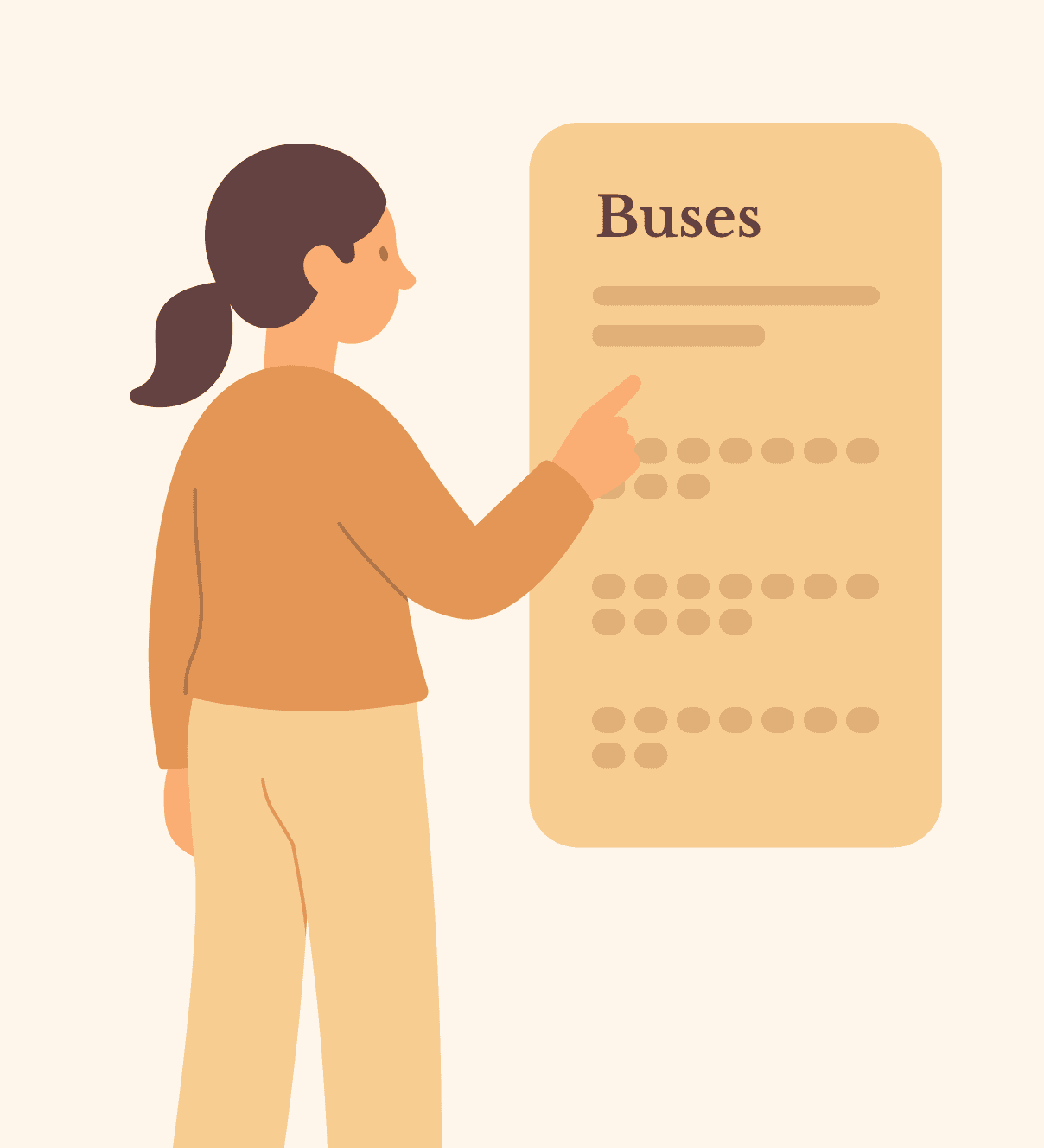
From web to app: adding bus schedules
IOS ✦ cross-team ✦ 2024
From web to app: adding bus schedules
IOS ✦ cross-team ✦ 2024
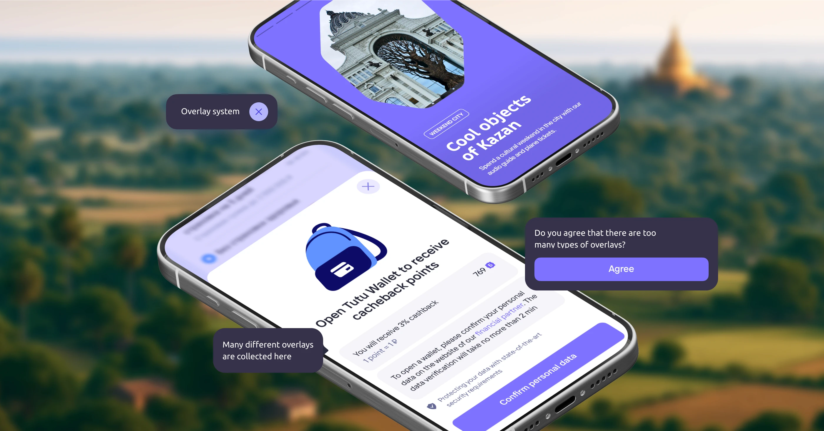
Tutu is a company building a multi-functional travel platform where users can buy tickets for different types of transportation. I brought a popular feature from our website — bus schedules — to our mobile apps and made it as seamless as possible.
My role: I conducted research, developed concepts, tested ideas, and supervised the implementation
Metrics
15% use schedule in main app
35% use it in bus tickets app
18% new users start with schedule

The bus schedule pages on our website attracted over 2 million unique visitors each month. Many of them searched for routes without online ticketing — the only way to get that information in our service was through schedules. But in the mobile apps, this feature was missing, leaving a major UX gap and no way to serve these users.
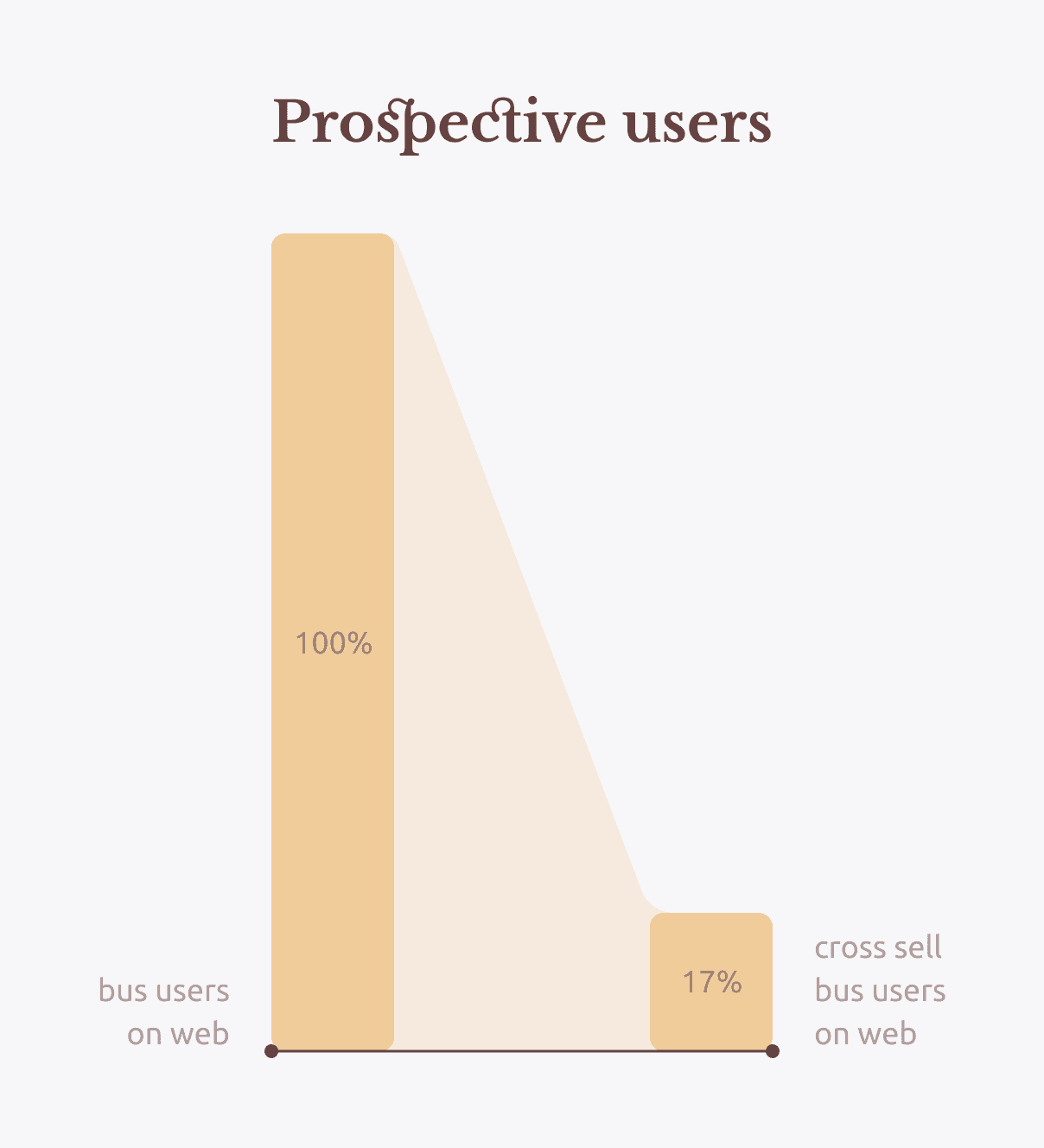
At the same time, 17% of bus schedule users on our website were already exploring other transport modes and hotels — showing strong potential for cross-selling inside the app. We needed to bring the schedule feature to both our main app and the standalone bus ap for best cross-sell.
Marketing team owned user acquisition — I focused on designing an intuitive user flow.
Company: tutu.ru
Founded: 2003
Users: 35+M MAU
Market: Russia
Tutu is the most visited online travel service in Russia, where users can buy train, plane and bus tickets, book hotels, find train or bus schedules and use AI travel assistant.
Project Overview
The bus schedule pages on our website attracted over 2 million unique visitors each month. Many of them searched for routes without online ticketing — the only way to get that information in our service was through schedules. But in the mobile apps, this feature was missing, leaving a major UX gap and no way to serve these users.
At the same time, 17% of bus schedule users on our website were already exploring other transport modes and hotels — showing strong potential for cross-selling inside the app. We needed to bring the schedule feature to both our main app and the standalone bus ap for best cross-sell.
Marketing team owned user acquisition — I focused on designing an intuitive user flow.
Company: tutu.ru
Founded: 2003
Users: 35+M MAU
Market: Russia
Tutu is the most visited online travel service in Russia, where users can buy train, plane and bus tickets, book hotels, find train or bus schedules and use AI travel assistant.
Project Overview
We are losing potential users who could be converted into app users, driving more cross-sell opportunities.
Business problem
Users problem
Out of 2 million monthly users, 1.6 million land on the schedules from search engines. Instead of having quick access through an installed app, they have to search for schedules sites every time.
We couldn’t implement cross-selling or display different types of transport in a single search results list
Business problem
Users problem
They found it difficult to navigate when trying to compare or purchase different types of transport
Our app brings together all verticals — buses, flights, trains, and hotels — accessible via a shared search form on the main screen. But the existing UX already was confusing.
Ownership was also split: the main screen belonged to the mobile app team, while transport search results were managed by the cross-product search team. This meant every solution had to be aligned across multiple teams.
We also knew development wouldn’t be straightforward. Since we were integrating into legacy code owned by other teams, it was hard to predict where blockers would appear — and we had to be ready to adapt the flow along the way.
Constraints and risks
We planned to track schedule open rate, conversion to search from schedule, bounce rates, and user engagement after interacting with the schedule.
Metrics
We planned to track schedule open rate, conversion to search from schedule, bounce rates, and user engagement after interacting with the schedule.
Metrics
After diving into the project, I defined four main goals:
• Implement the schedule feature into two our apps
• Create intuitive entry points
• Design easy-to-read schedule cards
• Make the transition from schedule to shopping smooth and natural
Tasks
After diving into the project, I defined four main goals:
• Implement the schedule feature into two our apps
• Create intuitive entry points
• Design easy-to-read schedule cards
• Make the transition from schedule to shopping smooth and natural
Tasks

I analysed user scenarios and reviewed visit analytics from the schedule section to identify pain points. I used the application team’s user behaviour analytics to help identify the most logical entry points for the new feature. I spent time studying our past reports and AB tests in confluence, as well as talking to my product analyst.
Research
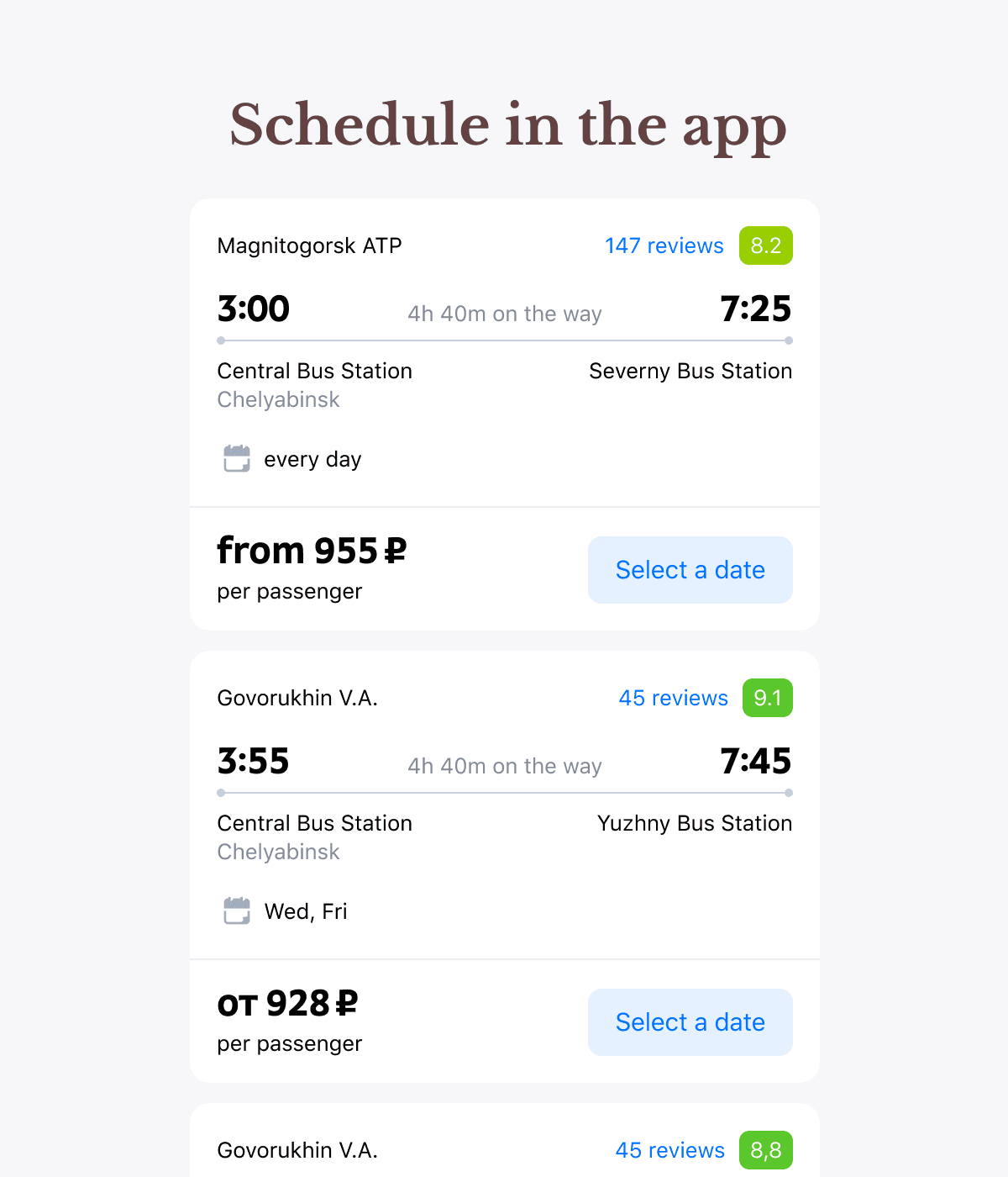
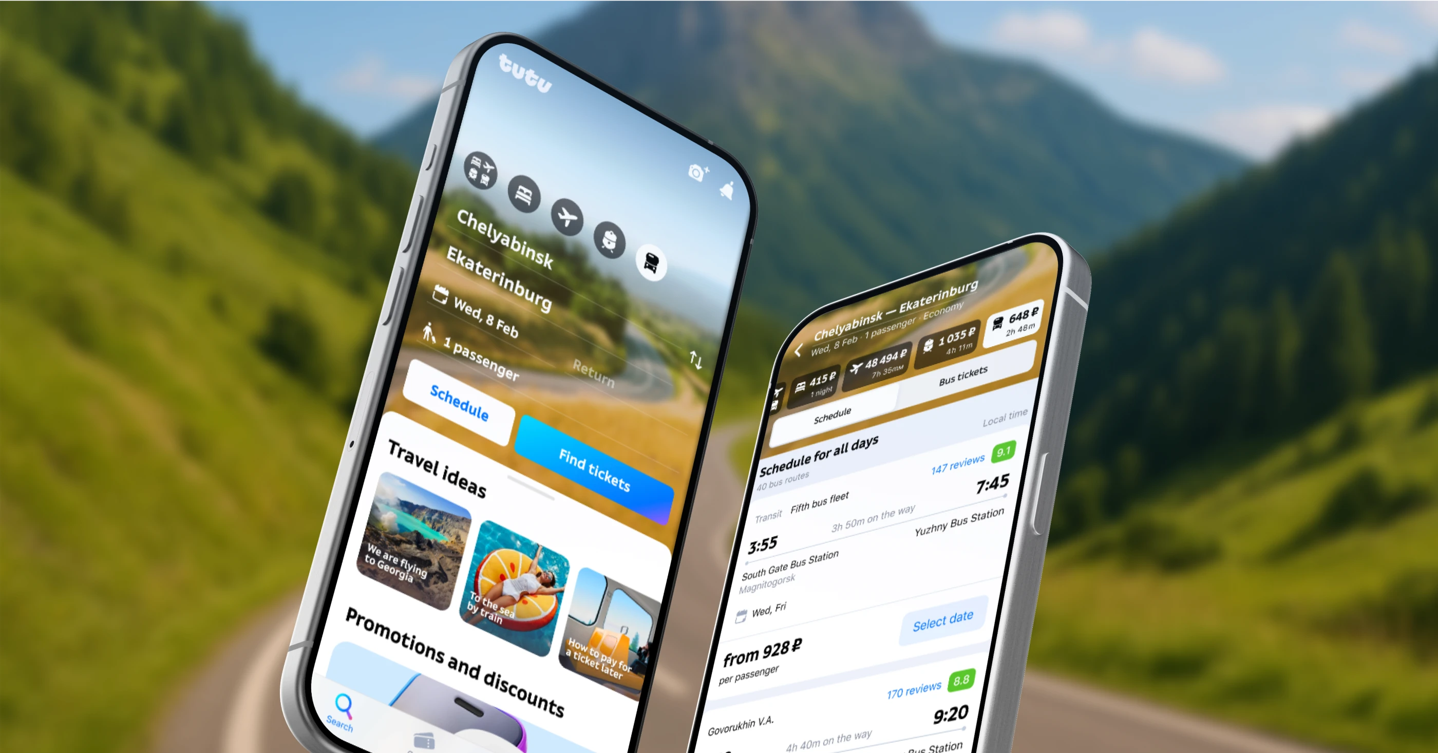
On the web version our schedule cards looked and worked very differently from ticket cards. However, a unified system was required for mobile.
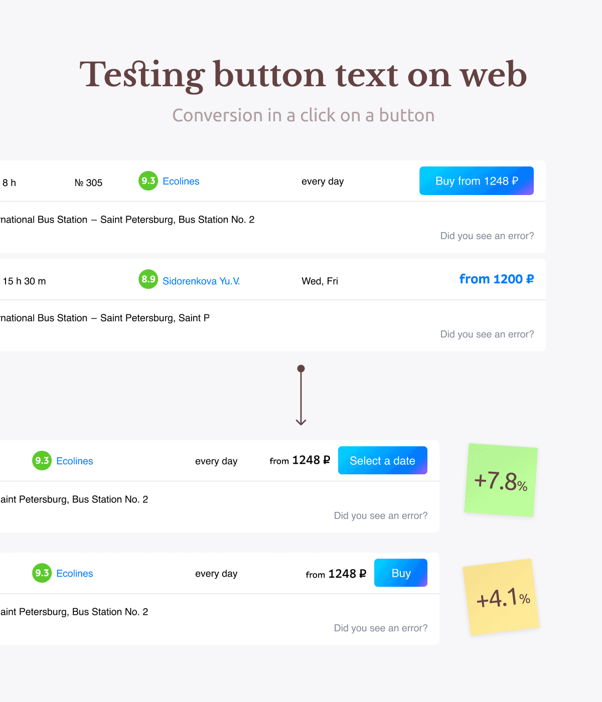
I kept the visual style of the cards and added an ’Pick a date’ button to each one, turning a dead end into a new opportunity. In parallel, we tasted different button naming options on the web version. This allowed us to launch the app feature with the most effective label from day one.
I created more than 20 options of entry points. There were many promising options with buttons, calendar, switches and a separate section for all schedules.
Ideation & Iteration
On the web version our schedule cards looked and worked very differently from ticket cards. However, a unified system was required for mobile.
I kept the visual style of the cards and added an ’Pick a date’ button to each one, turning a dead end into a new opportunity. In parallel, we tasted different button naming options on the web version. This allowed us to launch the app feature with the most effective label from day one.
I created more than 20 options of entry points. There were many promising options with buttons, calendar, switches and a separate section for all schedules.
Ideation & Iteration
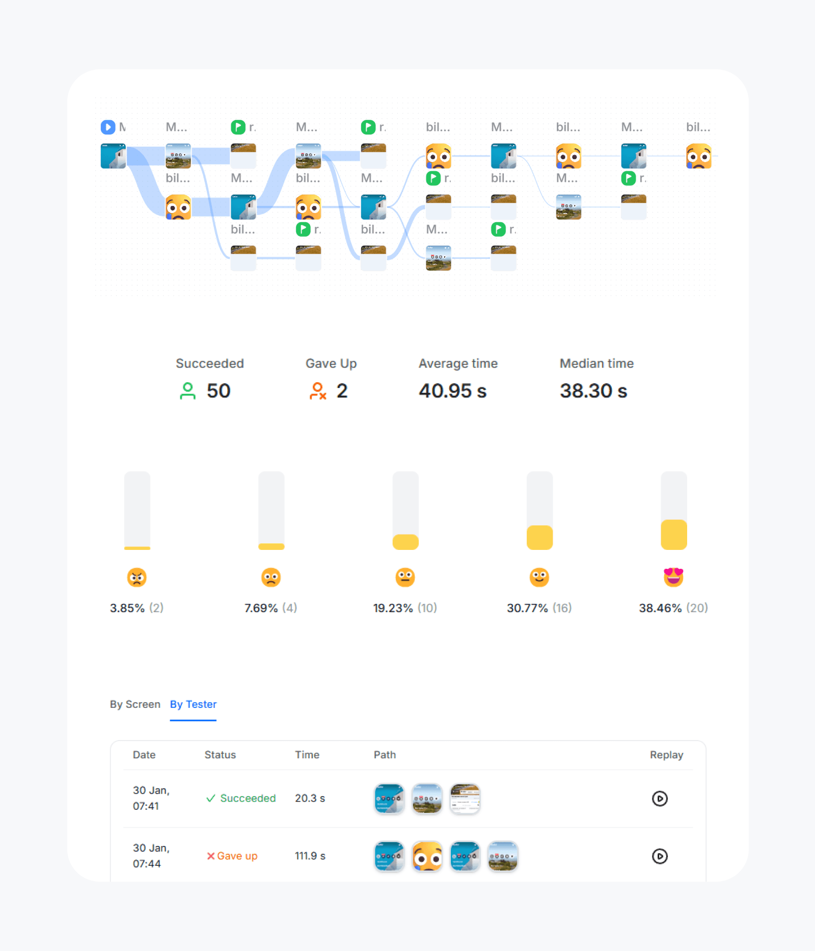
The early versions were too cluttered. To pick the best solution, I ran a series of user tests, measuring:
• Time to task completion
• Interface clarity and expectation matching
• Error rates, via clickmaps in prototypes
For example, for the main application screen test results showed that the buttons change depending on whether the date is selected or not confused users. The version with two persistent buttons had the lowest error rate — people found the schedule on their first try!


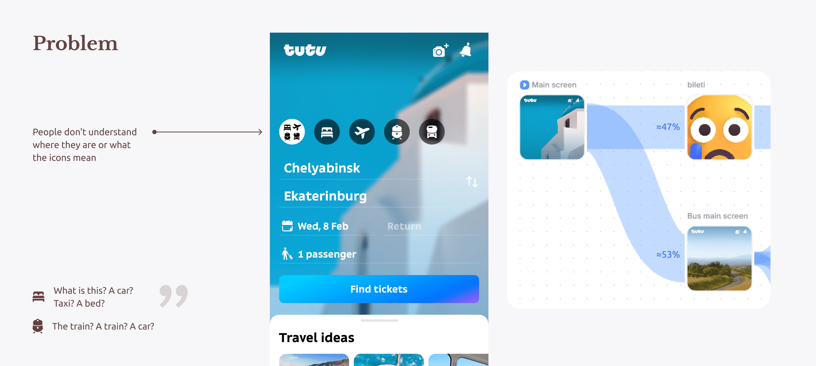
The biggest barrier to users completing the target action in testing turned out to be the very first screen they saw upon opening the app. People didn’t understand where to go, misread the meaning of icons in the tab bar, and the button labels didn’t help them navigate.
In all previous tests, almost 50% of users clicked the large blue button on the home screen — and ended up in completely the wrong place for their task.
Although radically changing the home screen wasn’t part of the scope, I decided to run additional tests to see how different information layouts would affect user behavior.
Major UX Issue
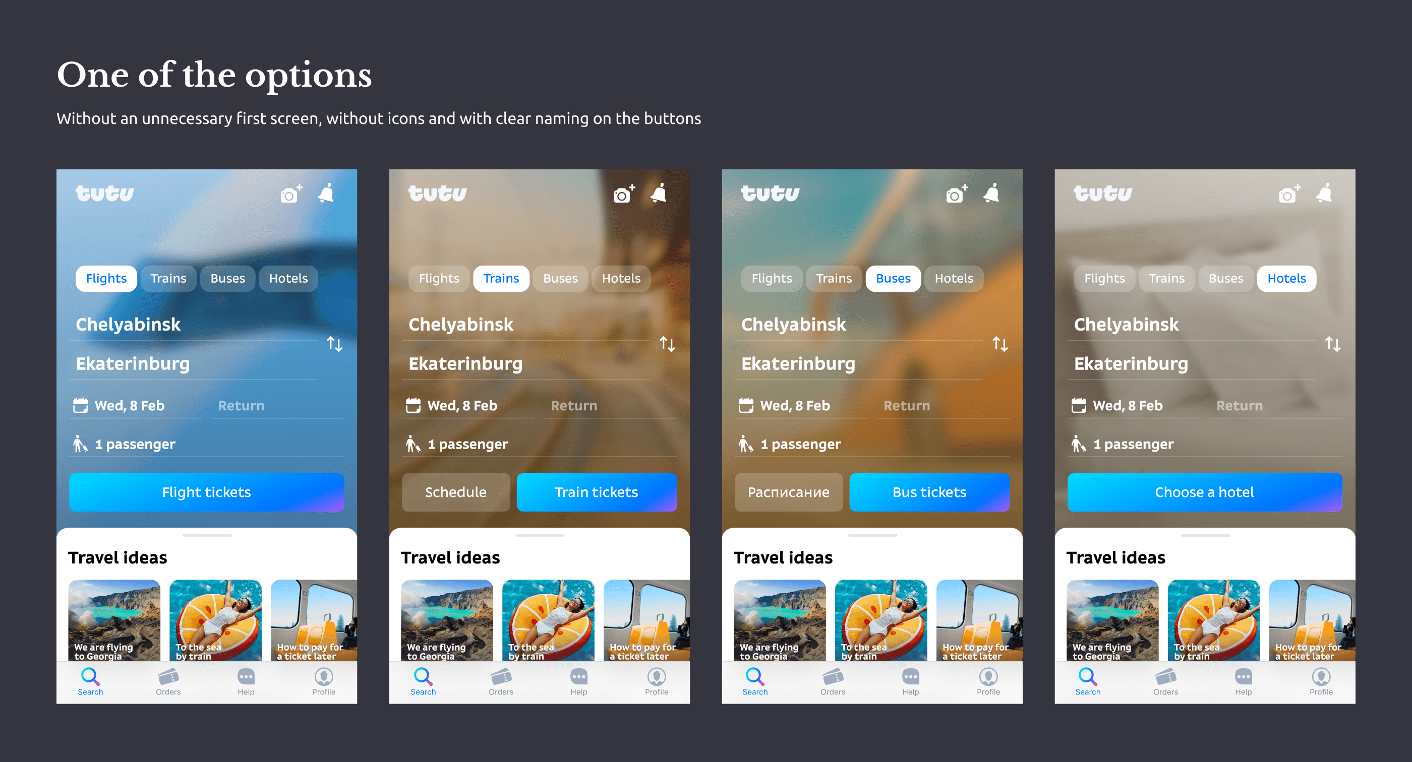
The turning point came when I removed an unnecessary step and renamed all buttons and tabs with clear, straightforward labels like “Plane tickets” or “Bus tickets.”
This improved:
• Users’ understanding of where they were
• Their expectations about what would happen after tapping
• Overall navigation through the app
I developed a full concept for updated navigation and passed it to the app team for improving the home screen UX — before returning to the schedule feature work.


Concept of the new navigation in the app
Concept of the new navigation in the app
After testing different solutions for the search results screen, I chose a version with tabs integrated into the existing transport tabs. This option extended the current navigation pattern, caused no user confusion during testing, and preserved vertical space — allowing users to see more results at once.
However, I encountered two obstacles:
Alignment & Tradeoffs
The head of the search results team disliked the option for personal reasons. She felt users wouldn’t understand it, and even live user testing didn’t convince her otherwise.
First obstacle
Second obstacle
When I was confident about the winning option, I asked our iOS developer to check whether the existing transport tab component could be adapted. Unfortunately, the change would add several extra days to the development timeline.
We couldn’t implement cross-selling or display different types of transport in a single search results list
Business problem
Users problem
They found it difficult to navigate when trying to compare or purchase different types of transport
To resolve the situation, I ran additional comparative tests on the two strongest candidates:
• one with tabs nested inside the transport tabs
• and the second with tabs directly below them, but remaining in the navigation section, separated from the content below
The second version performed only slightly worse (statistically insignificant), so we reached a compromise and moved forward with that implementation.

I defended a solution that maximized schedule visibility — new users should see it right away. And the unified design of the cards creates a seamless experience using the app.
Final solution
I defended a solution that maximized schedule visibility — new users should see it right away. And the unified design of the cards creates a seamless experience using the app.
Final solution
Colleagues from multiple teams praised the solution for how well it integrated into the existing interface — visually clean, functionally clear, and based on real user data.
Now, users can easily switch between viewing schedules and buying tickets — all in one app. It saves them time and gives us access to a wider audience, helping drive cross-sales for other products.
Metrics
• 15% of users in the main app use the schedule
• 35% in the dedicated bus app check it regularly
• 18% of new users looking for bus start with the schedule
Results
Next case study
Clear UX, faster implementation of new solutions and dozens of hours saved in work communication
Next case study
Clear UX, faster implementation of new solutions and dozens of hours saved in work communication
ayano.kaito@gmail.com
© 2025 All rights reserved
ayano.kaito@gmail.com
© 2025 All rights reserved