product designer
Unified search result card for all product verticals
design system ✦ cross team ✦ 2023
Unified search result card for all product verticals
design system ✦ cross team ✦ 2023
I designed a scalable, all product search result card for all Tutu products. The component combined requirements from all verticals, passed testing, and became the standard used by all product teams. I leaded this transition, supported other designers, and oversaw implementation.
My role: concept author, lead designer, and key stakeholder
Growth of metrics
+9.6% to next step
+5.4% conversion to purchase


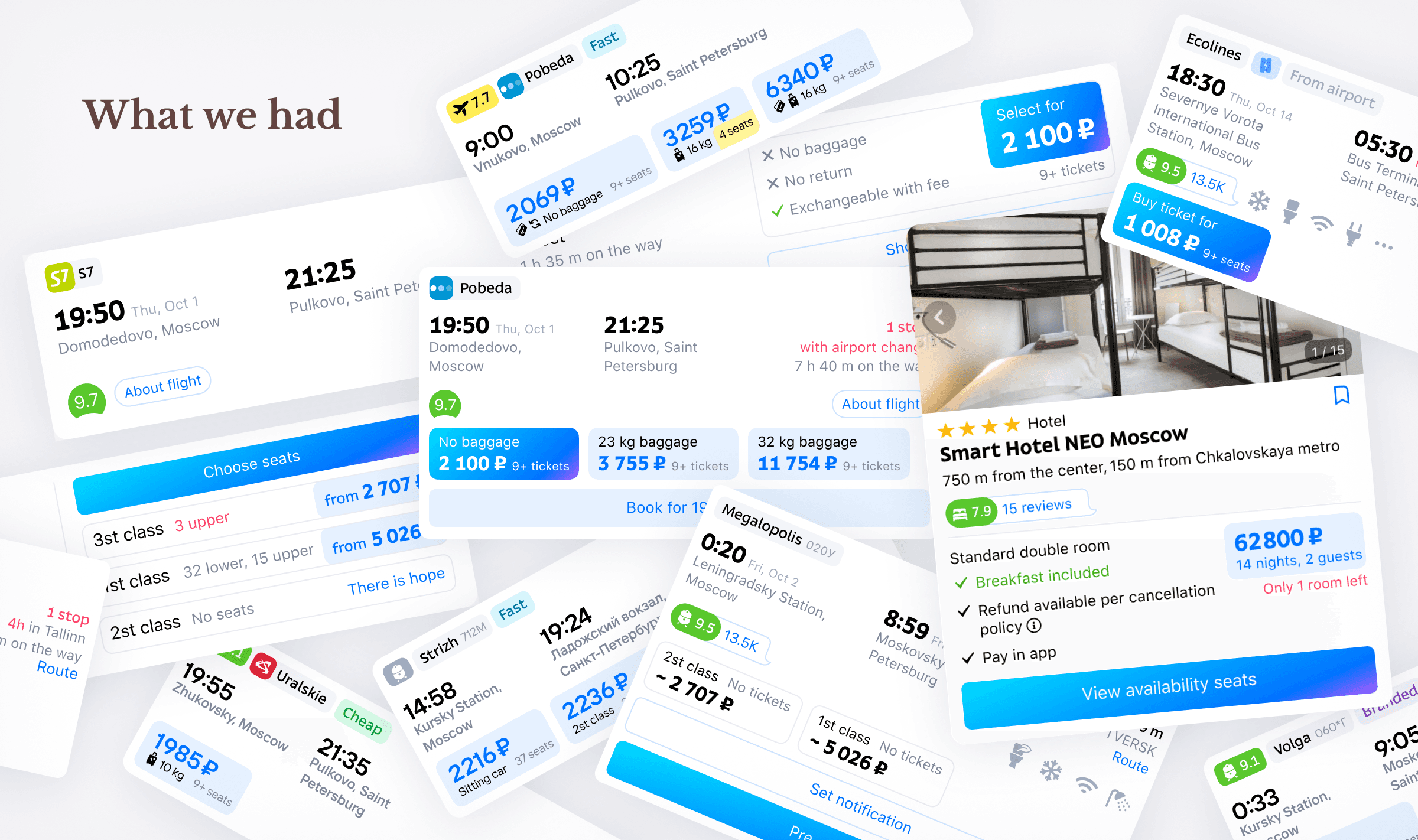
Tutu’s product line is diverse — each with different data models, UX patterns, and behaviors. The cards looked and worked differently. Each has its own implementation in code.
I was assigned to update the cards for buses. Other teams were expected to adapt their later. But this approach risked another round of patchwork and chaos — just replacing one set of inconsistencies with another.
So I proposed a different direction: to build one scalable foundation that would work for everyone.
Company: tutu.ru
Founded: 2003
Users: 35+M MAU
Market: Russia
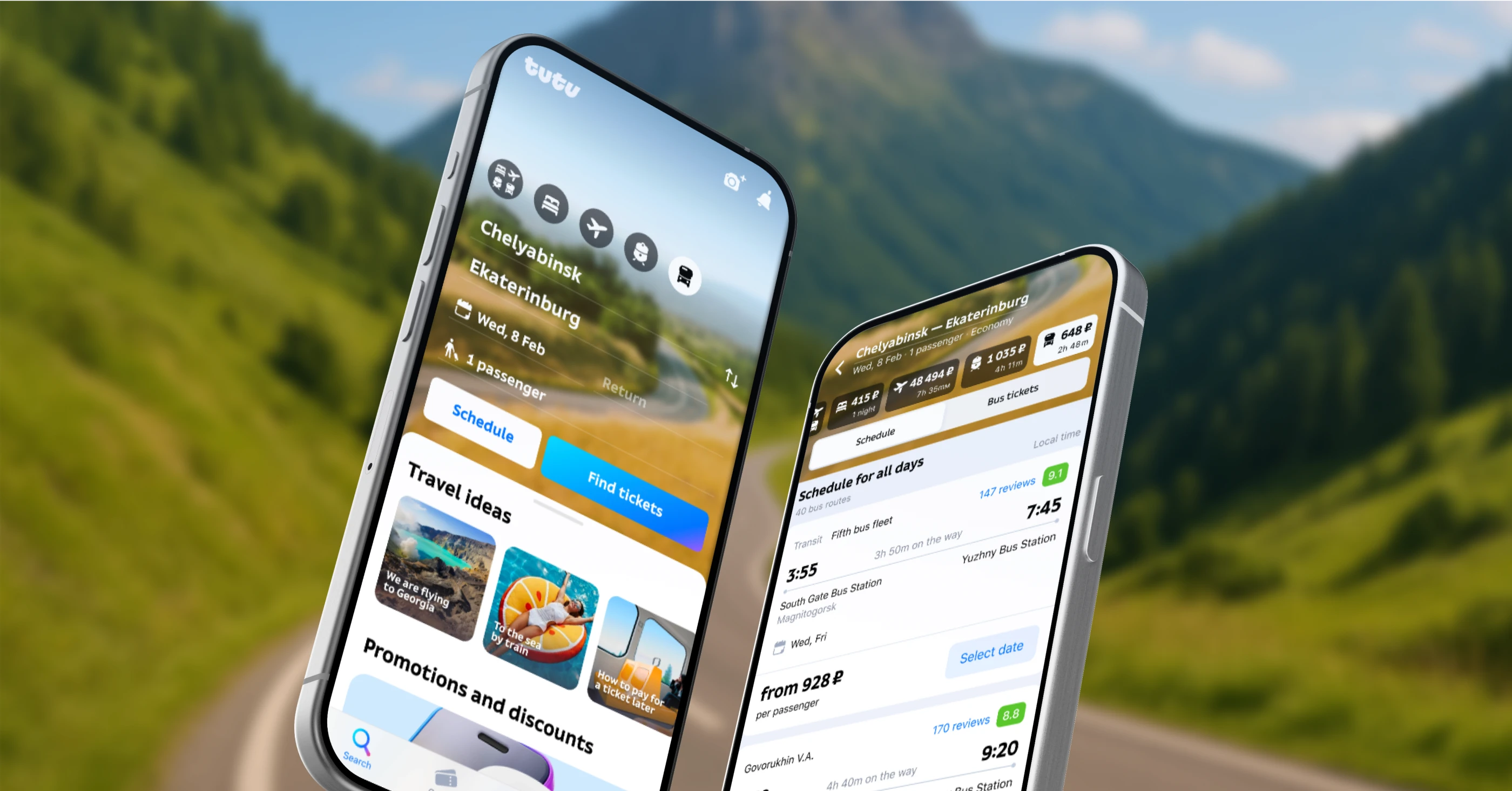
Tutu is the most visited online travel service in Russia, where users can buy train, plane and bus tickets, book hotels, find train or bus schedules and use AI travel assistant.
Project Overview
Tutu’s product line is diverse — each with different data models, UX patterns, and behaviors. The cards looked and worked differently. Each has its own implementation in code.
I was assigned to update the cards for buses. Other teams were expected to adapt their later. But this approach risked another round of patchwork and chaos — just replacing one set of inconsistencies with another.
So I proposed a different direction: to build one scalable foundation that would work for everyone.
Company: tutu.ru
Founded: 2003
Users: 35+M MAU
Market: Russia
Tutu is the most visited online travel service in Russia, where users can buy train, plane and bus tickets, book hotels, find train or bus schedules and use AI travel assistant.
Project Overview
We couldn’t implement cross-selling or display different types of transport in a single search results list
Business problem
Users problem
They found it difficult to navigate when trying to compare or purchase different types of transport
We couldn’t implement cross-selling or display different types of transport in a single search results list
Business problem
Users problem
They found it difficult to navigate when trying to compare or purchase different types of transport
Search is the first and a very important part of the sales funnel — all buyers and most users of the service go through it.
Search is the first and a very important part of the sales funnel — all buyers and most users of the service go through it.
Increase conversions to the next step of the funnel and conversion to purchase
Metrics
Increase conversions to the next step of the funnel and conversion to purchase
Metrics
• A card architecture that fits all product verticals and their specific needs
• Design a flexible component for controlled adaptation
• Update the styling to match our new branding
• Create a cross-platform component for our web, android and IOS platforms
Tech tasks
• A card architecture that fits all product verticals and their specific needs
• Design a flexible component for controlled adaptation
• Update the styling to match our new branding
• Create a cross-platform component for our web, android and IOS platforms
Tech tasks

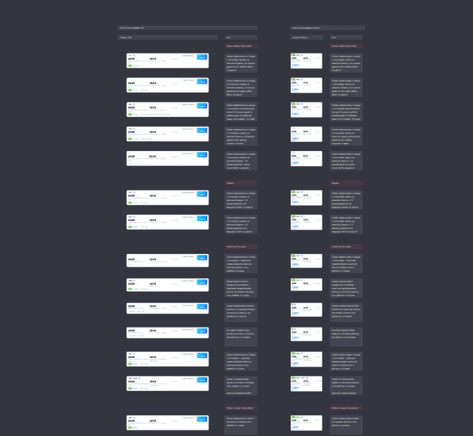
I gathered requirements and product specifics from all verticals. I met with designers and product owners from flights, trains, and hotels to learn how their fares work, how journeys are displayed, how galleries behave, and what was already tested. I dug through Confluence, took screenshots from production, and explored real interfaces to get a full picture of what this component needed to support.
Research


Analysis of current cards to identify points of improvement
Analysis of current cards to identify points of improvement
I created a complete concept and defended each design decision in discussions with the search product owner. I conducted tests on the more controversial parts of the design and managed all communication around the process.
We went through several rounds of iteration to improve the concept. I ran usability tests to validate UX choices. We spent especially much time on the route line — one of the most complex parts of the card — to ensure users could easily understand what was happening at a glance.
Iteration & Alignment


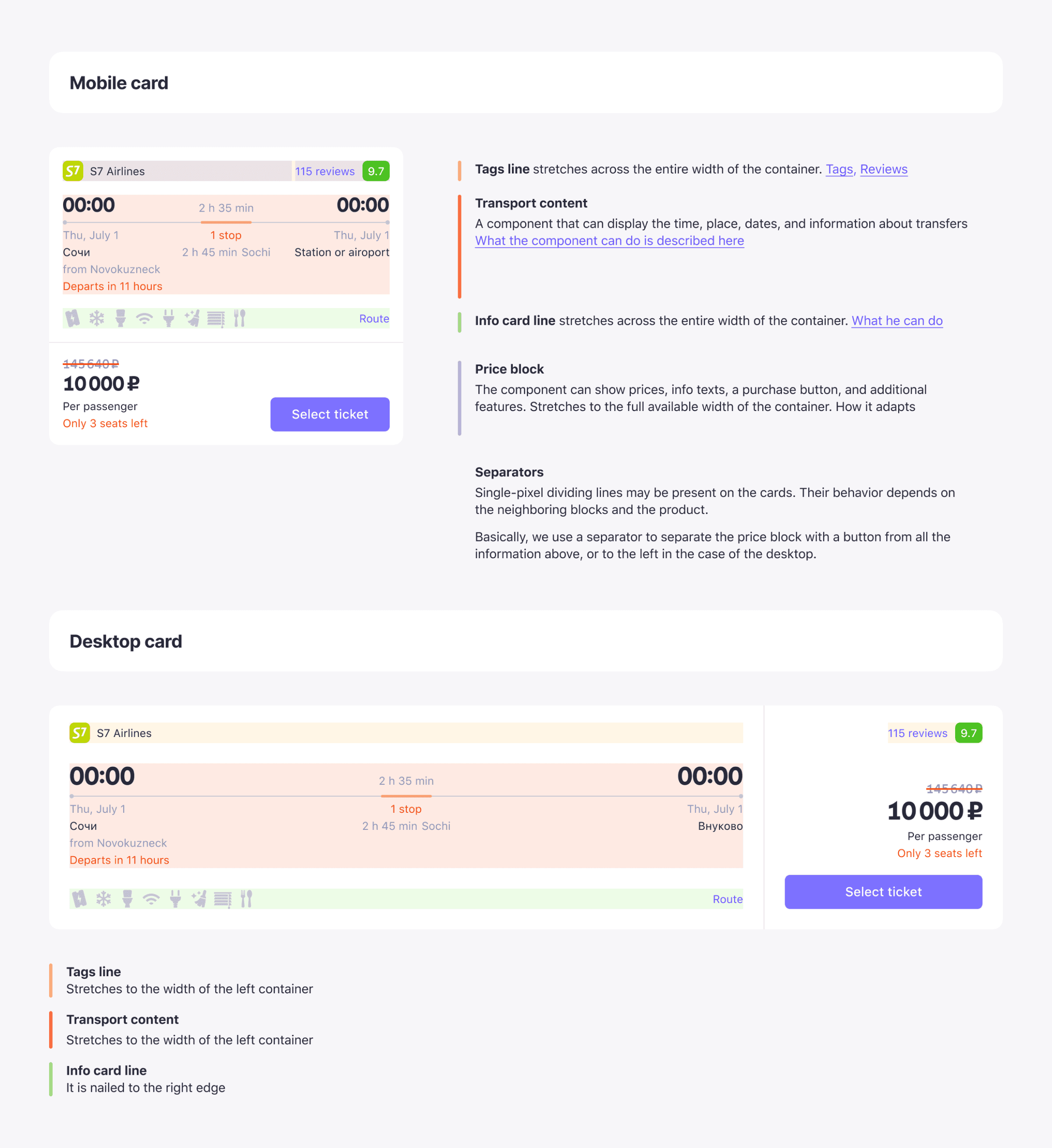
The component was built from three key blocks:
• Block with price
• Block with direction
• Unifying container into which it all fits
I tried to put together an easy-to-use tool.
Architecture
The component was built from three key blocks:
• Block with price
• Block with direction
• Unifying container into which it all fits
I tried to put together an easy-to-use tool.
Architecture

Part of the new card components
Part of the new card components
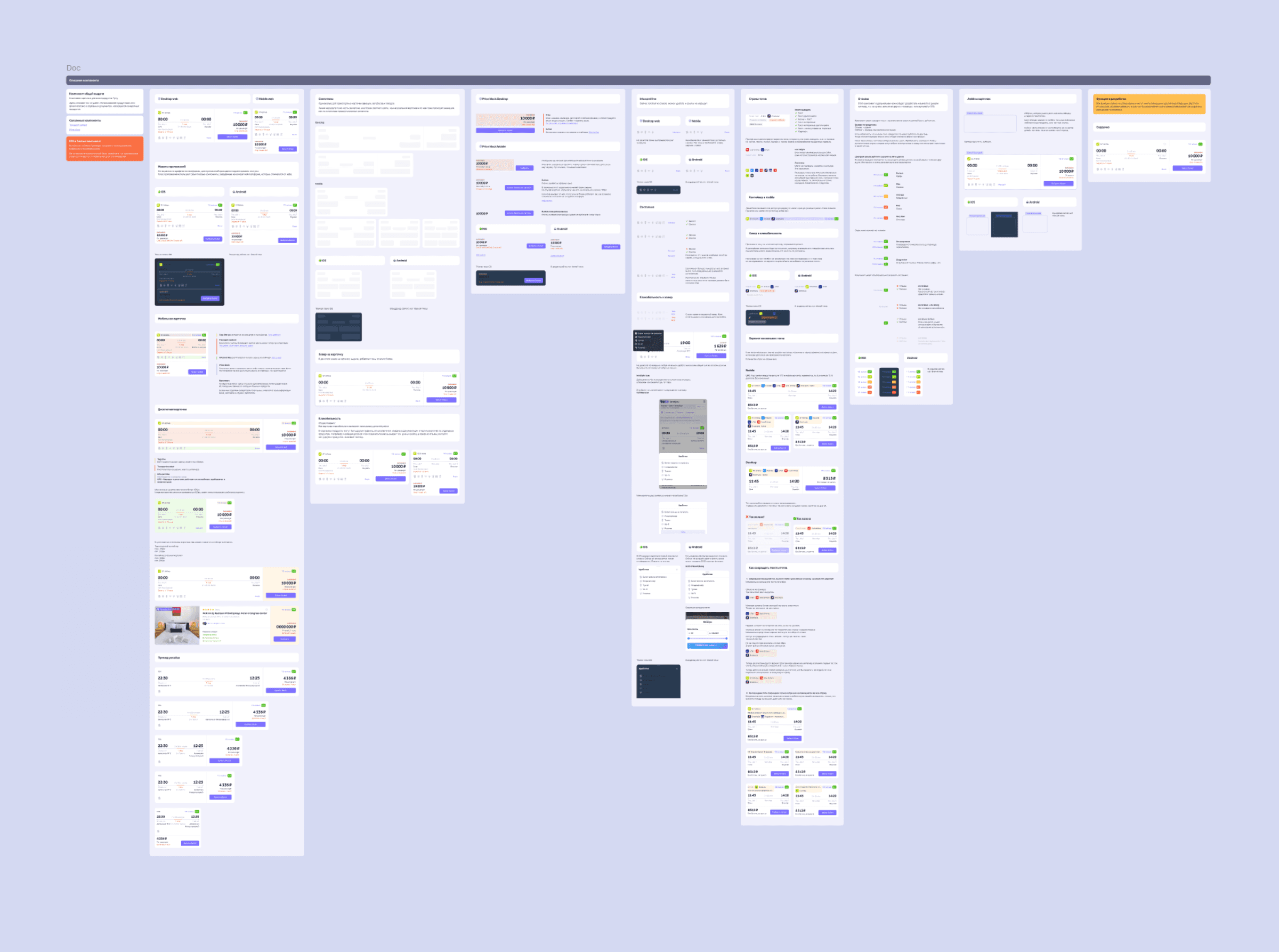
Then came the real magic: documentation.
Everything was modular and future-proofed — like building with Lego. I documented all of this — states, edge cases, responsive behavior, color themes, tap zones. I defined number rounding, empty state fallbacks, configuration options for each product.
It became a 3-page Figma spec that developers loved — a living tool with clear rules and shared agreements.
Documentation


One of the first calls with developers to present the documentation to them
One of the first calls with developers to present the documentation to them
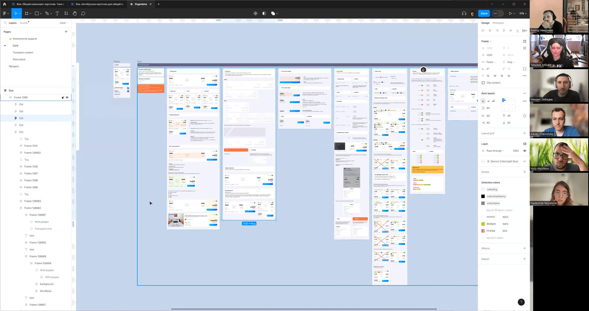
One of the challenges was the number of platforms we supported and the fact that teams had been working in isolation for a long time. As a result, developers on different platforms created local sets of components and styles.
It would seem that the same elements in the design had different sizes, line heights, letter spacings and other parameters.

Then I handed off the component to other teams.
Flights, trains, and hotels all adapted the card for their products — using the shared foundation. I supported them as a system lead: explaining what could be customized, where to plug in extra blocks, and how to keep logic intact. I reviewed their designs, gave feedback, and made sure everything stayed within system rules.
Collaboration
The component was fully implemented and adopted by multiple product teams. Designers and developers know how to use it, customize it, and maintain it.
Final solution
The component was fully implemented and adopted by multiple product teams. Designers and developers know how to use it, customize it, and maintain it.
Final solution


Now businesses can scale the solution and dive into the cross-sale, and users can quickly find what they need.
A month after launch, we ran A/B tests in the bus and flight verticals. The new card showed strong impact across platforms. They proved value — it unified cross-team work and improved key user flows and product KPIs.
Buses
+6.4% to next step
+2.3% conversion to purchase
Flights
+9.6% to next step
+5.4% conversion to purchase
Results
Next case study
• 15% of users in the main app use the schedule • 35% in the dedicated bus app check it regularly • 18% of new users looking for bus start with the schedule
Next case study
• 15% of users in the main app use the schedule • 35% in the dedicated bus app check it regularly • 18% of new users looking for bus start with the schedule
ayano.kaito@gmail.com
© 2025 All rights reserved
ayano.kaito@gmail.com
© 2025 All rights reserved